Your site’s navigation menu is one of the most important tools for helping visitors explore your content. A well-structured menu enhances usability, guides users smoothly, and reflects your site’s overall style. To ensure it looks and behaves the way you want, you can customize various elements like layout, fonts, and colors.
Table of Contents
Accessing Layout Options
To begin customizing your menu layout, navigate to:
Appearance > Customize > Header & Menu > General Settings
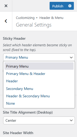
From here, you can configure several key options:
- Enable a sticky (fixed) header for easier access
- Adjust alignment, padding and width settings
- Choose the social icons location in the menu
- Replace the menu search form text
Note: To see layout changes take effect, make sure a menu is assigned to the correct location. For more details, see our article on how to change header and menu layout in WordPress.
Changing Menu Fonts & Colors
To personalize your menu’s color scheme:
Head to Appearance > Customize > Header & Menu > Fonts & Colors
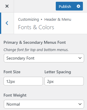
Here, you can tweak fonts and change the text color, hover states, background shades, and even border colors for various menu levels.
Configuring Mobile Menu
To fine-tune the mobile menu experience, go to:
Appearance > Customize > Header & Menu > Mobile Menu
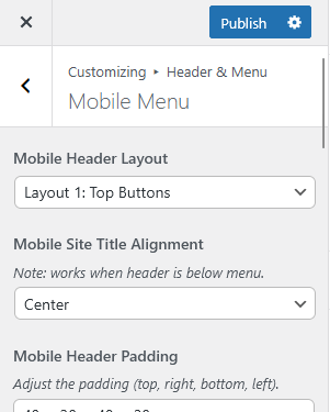
In this section, you can:
- Select a header layout (e.g., logo centered, or inline)
- Adjust alignment for the mobile site title or logo
- Customize header padding for better spacing
- Enable or disable the search icon in the mobile header
- Choose a mobile menu animation (such as slide, fade, or drop-down on click)
- Pick a custom icon for the mobile menu button (hamburger or dots)
Tip:
Always test your mobile menu on several screen sizes to make sure it remains intuitive and easy to use across all devices.